Letters shape more than words — they shape feelings and moods. Creative tools like a font generator now let anyone create unique type styles that catch the eye. These new trends are changing the way we connect through visuals. From business logos to social media posts, fonts play a huge role in communication. Let’s explore how the latest trends in lettering design are transforming how we see and understand messages every day.
Custom Typography: Making Brands Speak Their Own Language
Custom lettering has exploded in popularity as businesses want to stand out with unique identities. Instead of relying on common fonts, companies now prefer tailored designs that reflect their personality and values. As Linnea Holgersson from Creative Fabrica puts it: “Typography is more than just letters – it’s the foundation of a brand’s identity.” For example, Coca-Cola’s classic script font is instantly recognizable and evokes nostalgia and trust. Similarly, Spotify uses a custom, clean font that matches its modern, tech-forward brand. Imagine recognizing a logo not just by its image but also by the style of the letters themselves. This connection happens because a well-crafted font can evoke emotions and set a tone without saying a word. Modern tools have democratized creativity — now anyone can experiment with shapes, curves, and thickness to produce something original. This is a big shift in how brands communicate, helping them grab attention and build trust.How Tailored Lettering Shapes Identity
A customized font style can convey warmth, professionalism, or fun, depending on the design. It’s like hearing a voice instead of reading text. For example, the quirky, handwritten style of the Innocent Drinks logo gives a friendly and playful vibe, perfect for a health-conscious brand. Many big companies use exclusive lettering to create instantly recognizable identities that stand out in crowded markets. The uniqueness boosts brand loyalty and makes marketing more effective.The Role of User-Friendly Design Tools
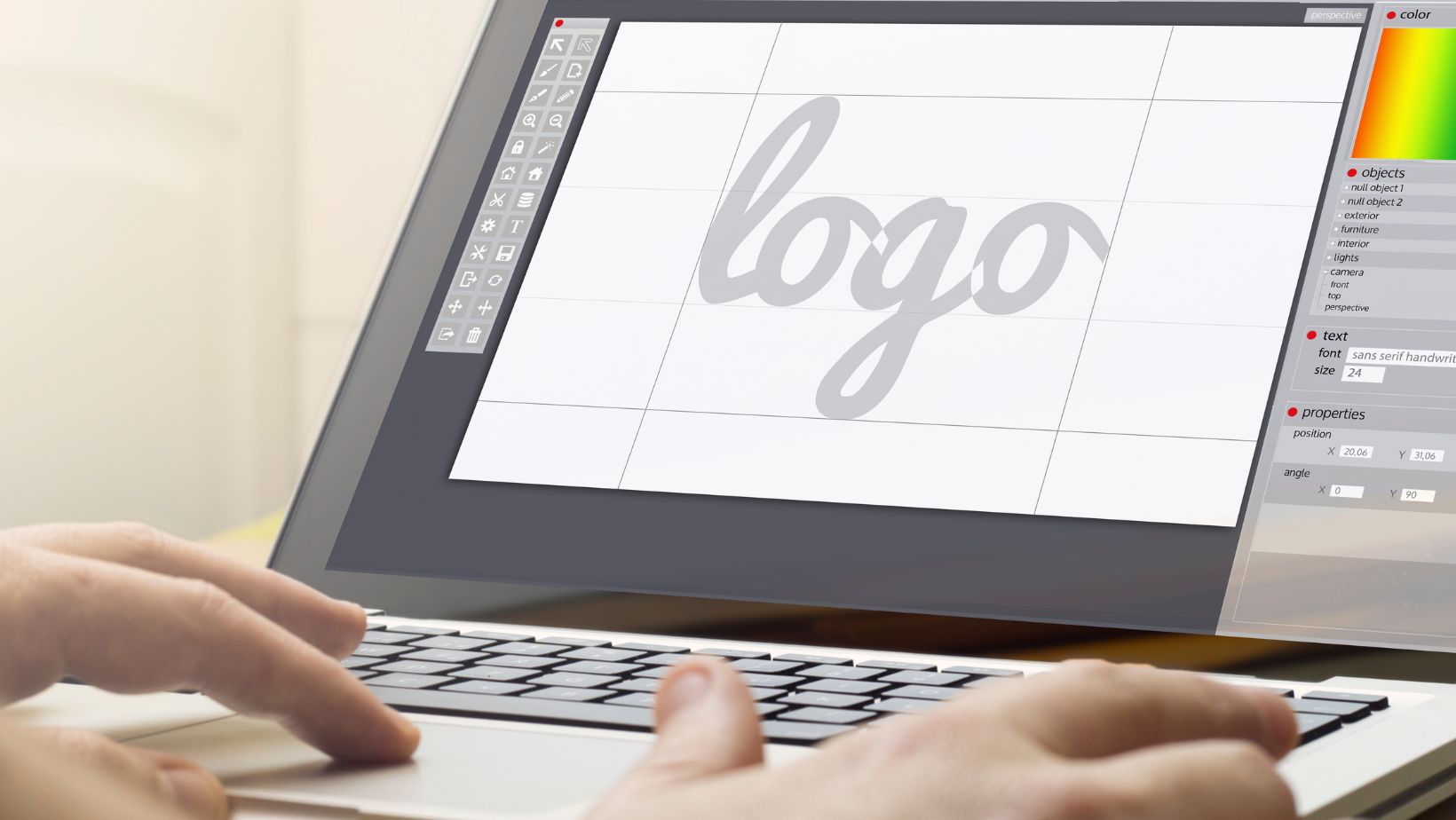
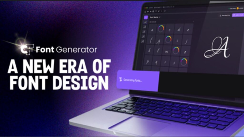
User-friendly generators and design software make crafting new font styles easier than ever. These platforms offer preset shapes and easy adjustments so even beginners can create professional looks. For instance, small businesses often use tools like Creative Fabrica’s font generator to develop logos or social media posts without hiring expensive designers. This accessibility sparks creativity among artists, small businesses, and hobbyists. It also encourages experimentation — designers can try bold or subtle changes and see results immediately. This opens a world of possibilities for fresh and diverse visual communication.Minimalist Lettering: Clean, Clear, and Versatile
Minimalism has become a cornerstone in modern design for its clarity and elegance. Simple, clean fonts remove unnecessary details to focus on pure readability and impact. Brands like Apple use minimalist typography to reinforce a sleek and innovative image. This approach works well for tech brands, editorial content, and user interfaces because it lets the message shine without distraction. Minimalist designs often use thin lines, open spaces, and straightforward shapes. The white space around letters plays a huge role — it gives the text room to breathe and guides the reader’s eye naturally. While minimalism can seem plain, good designers add subtle details that keep it interesting without clutter. On digital screens, these simple styles load faster and look crisp on all devices, improving the overall user experience.Striking the Balance Between Simplicity and Character
A minimalist style can sometimes feel cold or impersonal. That’s why designers carefully add small, unique features — like a slight curve or unexpected spacing — to keep things warm and inviting. For example, Google’s simple but slightly rounded typeface feels friendly while staying professional. This balance helps maintain professionalism without losing personality. It’s a powerful tool for brands that want to appear modern yet approachable.Why Negative Space Matters
Negative space, or the empty area around letters, plays a huge role in making minimal designs readable and elegant. It helps separate characters and words, making reading faster and more comfortable. Clever use of space also adds visual interest and can subtly communicate messages beyond the text itself. For instance, the FedEx logo cleverly uses negative space between the “E” and “x” to create an arrow, symbolizing speed and precision.